The Dashboard Wireframe Prompt (and 3 Ways It Fools You)
A copy-paste prompt for low-fidelity dashboard layouts, plus the seven-step check to run on whatever comes back before you show it to a stakeholder.
 Gabriel Thiery
Ask a model for a dashboard layout and it hands back something that looks genuinely good. Clean grid, sensible groupings, everything aligned. You come back to it the next morning and there's far too much on the page, and most of the time you spent went into elements that were never going to matter.
The failure isn't that the model got it wrong. It's that the output looks finished, and things that look finished stop getting argued with.
What a dashboard wireframe prompt is
A dashboard wireframe prompt is a set of instructions asking an LLM to produce a low-fidelity layout: which blocks go where, at what relative size, with grey boxes standing in for the actual charts. No colour, no styling, no real data. You're asking for structure, not a design.
People do this constantly now. One sixty-word wireframe prompt, pasted verbatim into Google, turns up seventy times in this site's own search data over twelve months, which is a decent sign the technique is running ahead of anyone's advice about it.
It works. That's worth saying plainly, because the useful criticism here isn't "AI can't design dashboards." It will produce a reasonable starting layout faster than you can open a drawing tool. The problem is narrower and more annoying than that.
What the prompt has to specify
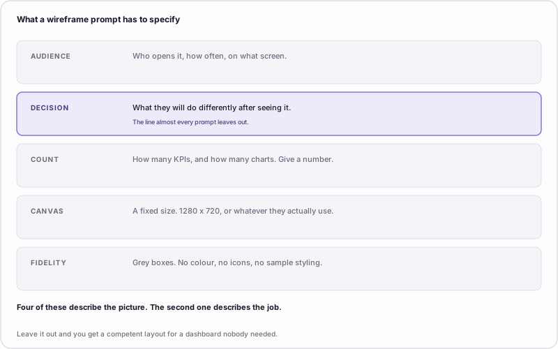
Four of these describe the picture. The second one describes the job.
The prompts that turn up in search do exactly this. They specify the picture in careful detail, naming a sidebar navigation pattern, a top-bar search, three high-level KPI cards, a multi-series line chart and a table for granular records, and they never once say what the person opening this dashboard is supposed to do about what they see.
That omission is not harmless, because the model won't stop and ask. It'll infer a plausible purpose from the components you listed and lay the page out for that. You get a competent dashboard for a job nobody was doing.
The prompt
⬇ Download the prompt and the reading checklist (Markdown) — no email required.
You are producing a low-fidelity dashboard wireframe. Grey boxes only.

CONTEXT
- Audience: [who opens this, how often, on what screen]
- Decision: [what they will do differently after seeing it]
- Platform: [Power BI / Tableau / Looker Studio]
- Canvas: [1280x720, or the size this audience actually uses]

CONSTRAINTS
- At most [N] KPI cards and [N] charts. Do not exceed these numbers.
- Every KPI card carries a comparison: vs target, vs prior period, or vs
  prior year. If a metric has no meaningful comparison, leave it out.
- The number that answers the decision goes in the top-left position.
- No colour, no icons, no logos, no imagery, no styling flourishes.
- Label every box with what it contains.

OUTPUT
For each element give me:
  - position (row, column)
  - relative width
  - what it shows
  - one sentence on why it earns its place

Then, separately, list everything you considered and left out, and why.
I wrote this one for this article rather than pulling it out of a project folder, so treat it as a starting structure rather than a magic incantation. The parts worth keeping are the explicit counts, the comparison rule, and the last instruction.
That last one earns its place. A model asked for a layout gives you a layout. A model asked what it discarded has to show its work, and the discard list is usually where you find out it was guessing about the parts you didn't specify.
Three ways the output fools you
1. It fills the canvas it was given
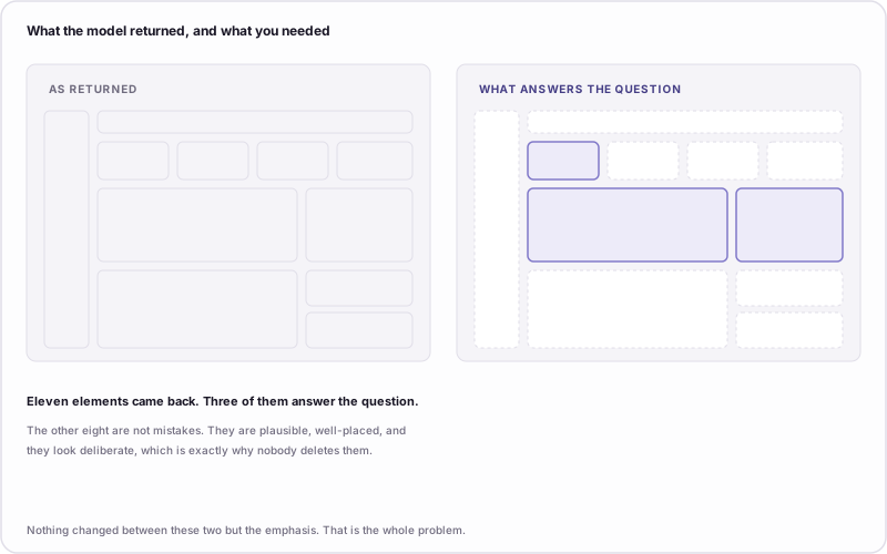
Eleven elements came back. Three of them answer the question.
Models are not good at leaving space empty. Give one a canvas and it will populate the canvas, because a full layout reads as a more complete answer than a sparse one. Ask for a dashboard and you'll get a sidebar you didn't need, a secondary breakdown nobody requested, and two small cards in the bottom-right that exist because the bottom-right was available.
None of those are errors. Each is defensible on its own. They're plausible, well-placed, and they look deliberate, which is precisely why nobody deletes them.
The fix is a number. Say "at most four KPI cards and two charts" and the model will respect it. Say "a dashboard" and you're letting the canvas size decide your metric count, which is backwards.
2. It answers a question nobody asked
This is the same failure a human makes when they build without requirements, just faster and with better spacing.
If your prompt doesn't say what decision the dashboard supports, the model infers one. It's good at inferring. The layout it returns will be internally coherent, will look purposeful, and will be organised around a goal you never chose. And because it looks purposeful, you're less likely to notice the goal is wrong than you would be with a scrappy hand sketch.
The test is the same one worth asking a stakeholder: what will you do differently after seeing this? If you can't answer it before writing the prompt, the model can't either.
3. It hands you something you can't hand to anyone else
You get back a description. Rows, columns, relative widths, sometimes ASCII art. That's fine for you, because you asked for it and you're holding the whole context in your head.
Now try sending it to the stakeholder who requested the dashboard. They will not read a nested list of layout elements and form an opinion about information hierarchy. They'll say it looks fine, because saying it looks fine is the only available response to a document like that.
The description isn't the artifact. It's an instruction for making the artifact, and the whole point of sketching early is having something a non-technical person can react to.
How to read the output before you trust it
Two minutes, before you show the layout to anyone.
- Count the elements. Write the number down. It's almost always higher than the number you asked for.
- Point at the decision. Which single element answers it? If you have to think about it, the layout hasn't answered it.
- Delete everything that isn't the answer or context for the answer. Do this before you get attached. Whatever you can't bring yourself to delete is worth keeping, and now you know why.
- Check every KPI card for a comparison. A bare number tells the reader where they are without telling them whether that's good.
- Check the top-left. That position is read first and read most. If something decorative is sitting there, the layout is wrong no matter how it looks.
- Read the discard list. If the model dropped something you needed, your brief was incomplete, not the model.
- Look at it again tomorrow. The most reliable test on this list, and the one people skip.
Step 3 is the one that does the work. Deleting is uncomfortable in proportion to how finished something looks, which is why it's worth doing deliberately rather than waiting to feel like it.
Why a better prompt isn't the fix
The obvious conclusion from all this is that you need a better prompt. More constraints, tighter counts, stricter fidelity instructions.
That helps, and it isn't the real answer.
The real answer is that low fidelity is a feature, and it's the feature you lose first when a model does the sketching. A wireframe is deliberately unfinished so that you judge the structure instead of the finish. Nobody looks at four grey rectangles and says "nice work". They say "why is that there", which is the entire reason to make one.
An LLM hands you high fidelity at exactly the moment high fidelity does the most damage. The output arrives looking resolved, and resolved things attract approval rather than argument. That is how a dashboard ends up carrying eleven elements nobody quite remembers agreeing to.
So use the prompt. It's a genuinely fast way to get a first structure, and it's better than a blank canvas. Then strip it back down to something that looks unfinished again before you show it to a single other person, because the version that looks unfinished is the version people will actually tell you the truth about.
Common questions
Which model is best for dashboard wireframes? They're close enough that it doesn't matter much. The variance between two prompts is much larger than the variance between two models, and the failure modes above show up in all of them.
Can I get an LLM to output an actual image of the wireframe? Sometimes, and it usually makes things worse. An image is higher fidelity than a description, so it triggers the approval reflex harder while still being something you can't edit in front of a stakeholder.
Is this faster than sketching it myself? For a first structure, yes. For the third revision after a stakeholder review, no, because at that point you're making small positional changes and describing them in prose is slower than moving a box.
What about using AI to build the whole dashboard? Different question with a different answer. Can AI build your dashboard covers what the current generation of tools actually does in the BI stack.
Take the prompt, fill in the decision line before anything else, and then run the seven-step read on whatever comes back. If you want the structure for working out that decision line in the first place, the requirements template is the conversation it comes from.

Gabriel Thiery
Builder of datawirefra.me. I help BI teams plan dashboards people actually use — before they write a single DAX formula.
Connect on LinkedIn